Anyone seen the new Google SERPs Card View In Testing ?
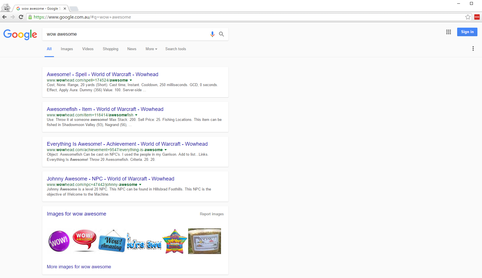
Here is a screenshot of what I recently witnessed whilst viewing in incognito mode, what do you think ?
Personally, I like it. It now puts inline the design of the whole material feel Google has been rolling out for the past couple of years now. It also goes in line with the card view of their mobile search results they have rolled out not too long ago.
For the past couple of years, you would have seen that since Material design was introduced they have been rolling out this UI design to their whole family of applications. Drive only recently got another update which retouches the interface to look more minimal. It looks like Gmail itself is lagging behind which really sucks, considering I hate the stock UI and have had to resort to using my own third party stylish theme I created to match the more modern Google Drive interface.
We are not sure if this is just an experiment by Google or if they are starting to roll this out to different countries slowly. If you have noticed this also, let us know what you think.


